
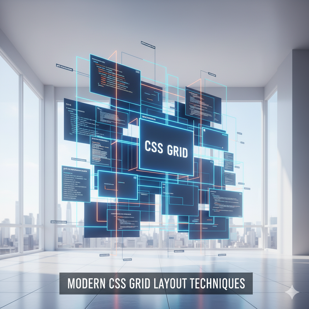
CSS Grid Revolution
CSS Grid has revolutionized how we approach web layouts. Unlike flexbox, which is one-dimensional, CSS Grid is a two-dimensional layout system that allows us to work with both rows and columns.
Basic Grid Setup
.container {\n display: grid;\n grid-template-columns: repeat(3, 1fr);\n gap: 20px;\n}This creates a responsive three-column layout with equal spacing.
Sign in to like, dislike or bookmark this post.


Comments (0)
Leave a Comment
No comments yet
Be the first to share your thoughts!